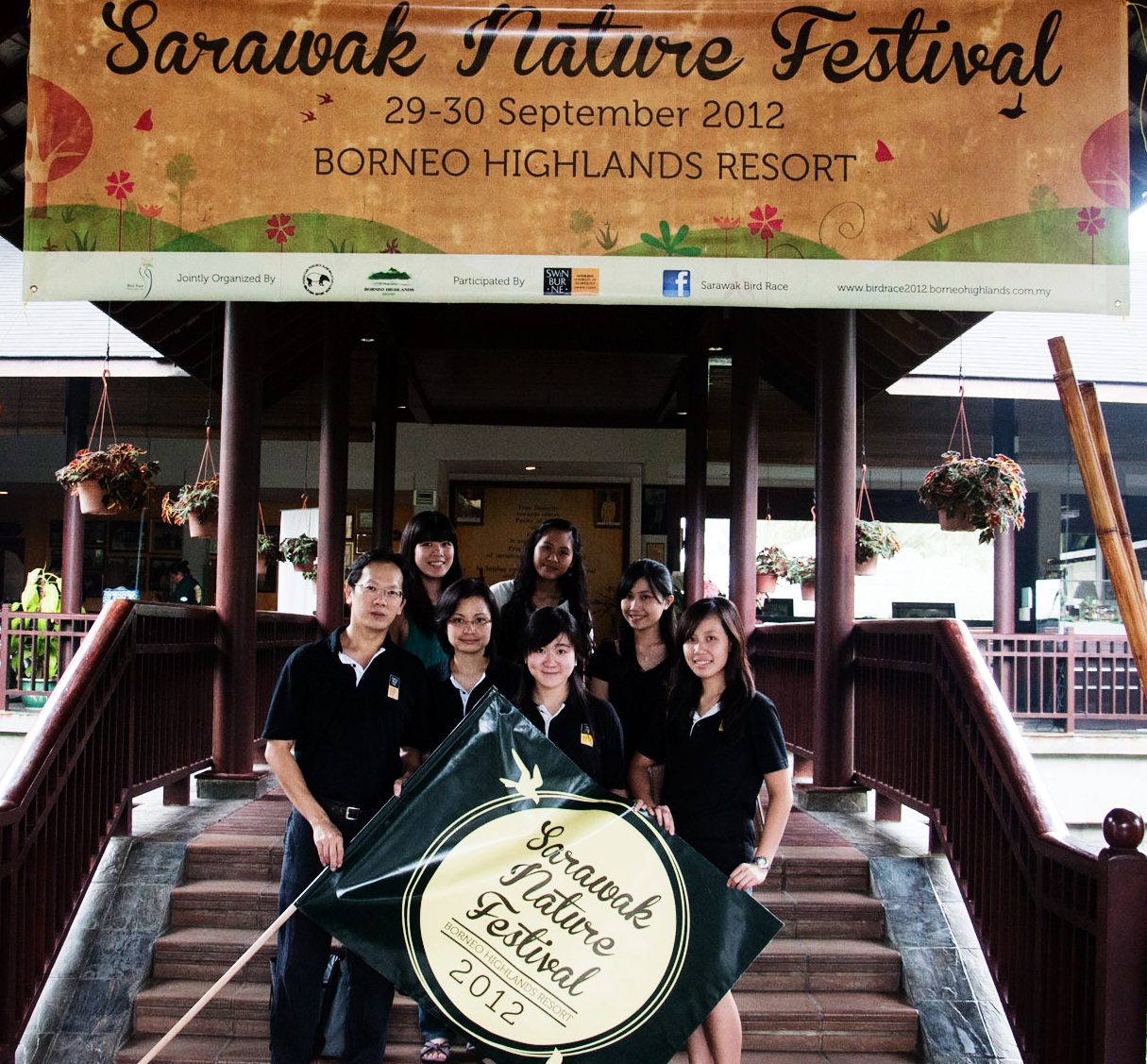
KUCHING –The work of three design students made such an impression on the organisers of the recent Sarawak Nature Festival that their artwork was selected to symbolise the event.
Undergraduate graphic design students Marilyn Ang, Dayang Nurul Aini and Ivy Lai took on the challenge when Malaysian Nature Society and Borneo Highlands, the organisations which managed the event, approached Swinburne University of Technology Sarawak Campus where they are currently studying, to come up with the visual designs
The festival, which was held in September, included a bird race and a biotechnology workshop, all of which required specific visual designs.
The three students came up with the illustrations for banners, shirts, logos, stickers, pamphlets and posters that would eventually become the ‘face’ of the event.
Ang, who applied several techniques she had learned at Swinburne Sarawak for her shirt designs, described working on the project as time well spent.
“I found it fulfilling because it’s something that I really like to do. It was an opportunity to better myself and expand my horizons as a graphic designer,” she said, adding that this was the first industry project she had undertaken and would happily highlight her work in her portfolio.
Fellow student Dayang Nurul Aini, who had done some design work for other clients in the past, said she took on the Sarawak Nature Festival challenge because she “knew it was going to be fun”.
“I really enjoyed it,” she said, explaining that her inspiration for her sticker design came from nature.
“It was something different but still maintained the overall theme of the festival.”
Ivy Lai, who came up with the visual identity for the event, said she had learned a lot from the project.“Seeing my designs being used as the promotional material also helped me to discover how design can impact my immediate surroundings,” she said.
Like Dayang Nurul Aini, nature played an important part in Lai’s design, where she incorporated colourful silhouettes of trees and birds to set the tone for her work. The use of texture in her pamphlets portrays a visual sense of adventure.
Lai said all three worked well as a team and helped each other out tremendously. When needed, they sought advice from their lecturers Michael Lee and Kristian Lee.
According to Lai, guests and organisers had good comments on their artwork. Bernard Tiang, one of the organisers, was among them.
“The designs are good and reflect the events well,” he said, adding that the logo for the festival was one of his favourites.


